
Gold Horizon Condition – ‘On Piece’
Posted: 21/06/2013 Filed under: Horizon, Label, Machin, Stamp Leave a commentThe third aspect of condition is the backing paper (or the ‘on piece’) that labels are adhered to. First off though you might think it’s best to collect off-paper in the traditional manner – but since the advent of self-adhesives this has not been a simple thing to achieve; after all self-adhesives are designed to prevent re-use. I have heard of various methods of removing paper successfully but 2 things inform against it:
- It costs money – special liquids even if ordinarily available in the household simply add to cost.
- There is always the danger of damaging the label itself.
And don’t try to iron them off like standard Security Machin’s- they go black!
So… what to look for. First off I look for a complete margin around the entire label – preferably without any writing on. As you can see from the illustration it’s a matter of aesthetics – it’s what looks good.

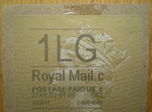
easily ripped – ho hum
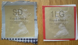
Next I look for good uniform colour. Although white brown and yellow are standardly acceptable I am happy to see black or even pink – but it must be uniform and not have (for instance) address or way-bill labels partially underneath – this just ruins the balance – aesthetics again! Also, with the one below/left the package surface is very uneven and disfigures the label.
The two labels below would have been most interesting had they not been cut out at all. They could then have been collected ‘on-cover’ or more accurately as ‘entires’ with the added benefit they come from postal stationery. They are both from packaging available at your local Postr Office! Not only are these visually unappealing the left one from a ‘bag’ has a tendency to curl – even if you had managed to cut straight edges!
- out of context

- not one for the album

- Cardboard box anyone? I think not!
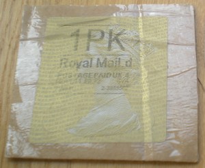
- annoyingly stuck under the label

- And sellotape? more unsightly with age!
So overall I would like to see a nice, clean cut margin of between ½cm to 1cm. Square cut in uniform colour with no other marks. Not too much, not too little, but juuuuust right!
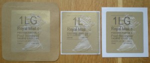
- too big – too small – just right!

Of course none of these criteria are particulary new – acceptable margins go back to the imperforate days of the 19th Century. One point I think is particularly pertinent is there is very much an argument for collecting Horizon Labels on cover (entire) as this truly captures their operational range – but it’s space consuming for one and unless you work in a ‘Returns’ department your not going to get a nice RSF label!

Recent Comments