
Gold Horizon Condition – ‘On Piece’
Posted: 21/06/2013 Filed under: Horizon, Label, Machin, Stamp Leave a commentThe third aspect of condition is the backing paper (or the ‘on piece’) that labels are adhered to. First off though you might think it’s best to collect off-paper in the traditional manner – but since the advent of self-adhesives this has not been a simple thing to achieve; after all self-adhesives are designed to prevent re-use. I have heard of various methods of removing paper successfully but 2 things inform against it:
- It costs money – special liquids even if ordinarily available in the household simply add to cost.
- There is always the danger of damaging the label itself.
And don’t try to iron them off like standard Security Machin’s- they go black!
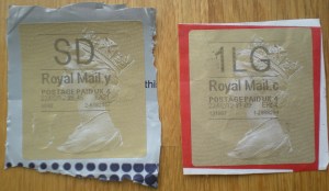
So… what to look for. First off I look for a complete margin around the entire label – preferably without any writing on. As you can see from the illustration it’s a matter of aesthetics – it’s what looks good.

easily ripped – ho hum
Next I look for good uniform colour. Although white brown and yellow are standardly acceptable I am happy to see black or even pink – but it must be uniform and not have (for instance) address or way-bill labels partially underneath – this just ruins the balance – aesthetics again! Also, with the one below/left the package surface is very uneven and disfigures the label.
The two labels below would have been most interesting had they not been cut out at all. They could then have been collected ‘on-cover’ or more accurately as ‘entires’ with the added benefit they come from postal stationery. They are both from packaging available at your local Postr Office! Not only are these visually unappealing the left one from a ‘bag’ has a tendency to curl – even if you had managed to cut straight edges!
- out of context

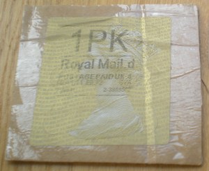
- not one for the album

- Cardboard box anyone? I think not!
- annoyingly stuck under the label

- And sellotape? more unsightly with age!
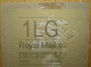
So overall I would like to see a nice, clean cut margin of between ½cm to 1cm. Square cut in uniform colour with no other marks. Not too much, not too little, but juuuuust right!
- too big – too small – just right!

Of course none of these criteria are particulary new – acceptable margins go back to the imperforate days of the 19th Century. One point I think is particularly pertinent is there is very much an argument for collecting Horizon Labels on cover (entire) as this truly captures their operational range – but it’s space consuming for one and unless you work in a ‘Returns’ department your not going to get a nice RSF label!
Gold Horizon – Overprint
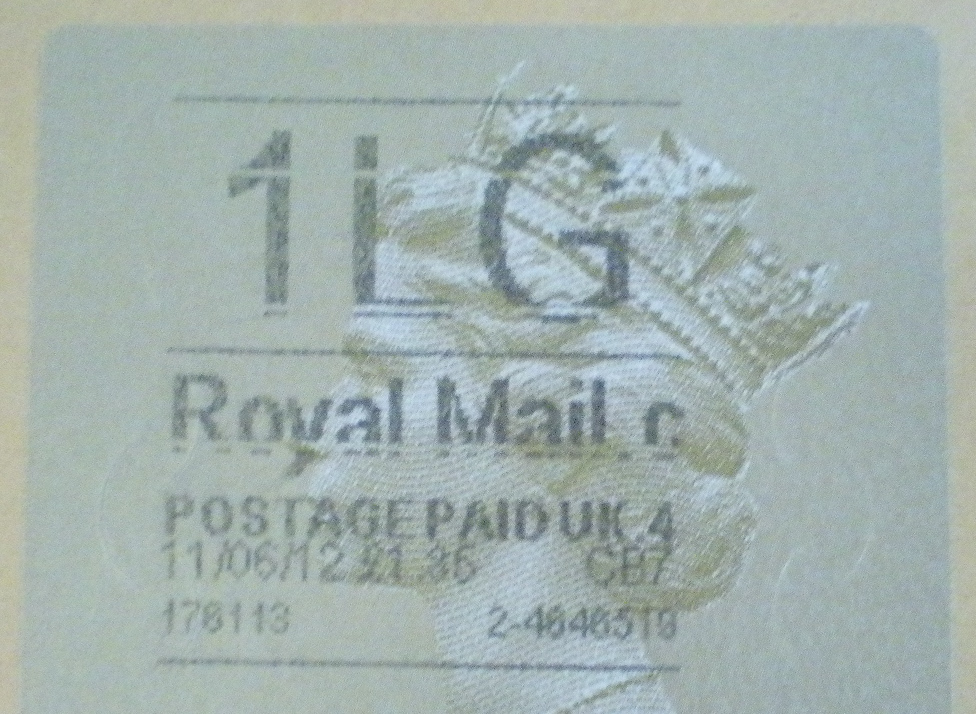
Posted: 04/06/2013 Filed under: Horizon, Machin, Stamp | Tags: cancellation, collectable, counter, Horizon, Machin, overprint, printer Leave a commentThe second area of condition I look at is the quality of the service indicating overprint which is printed at the counter. As you may imagine that as it’s down to individual counter-staff ‘on the job’ aesthetics comes very much a second place to excellent customer service! And inevitably printers have their off-days too! So I’d say it’s probably about 50 – 50 as to whether a decent looking label is produced! Here is what I look out for…
- Correct positioning:
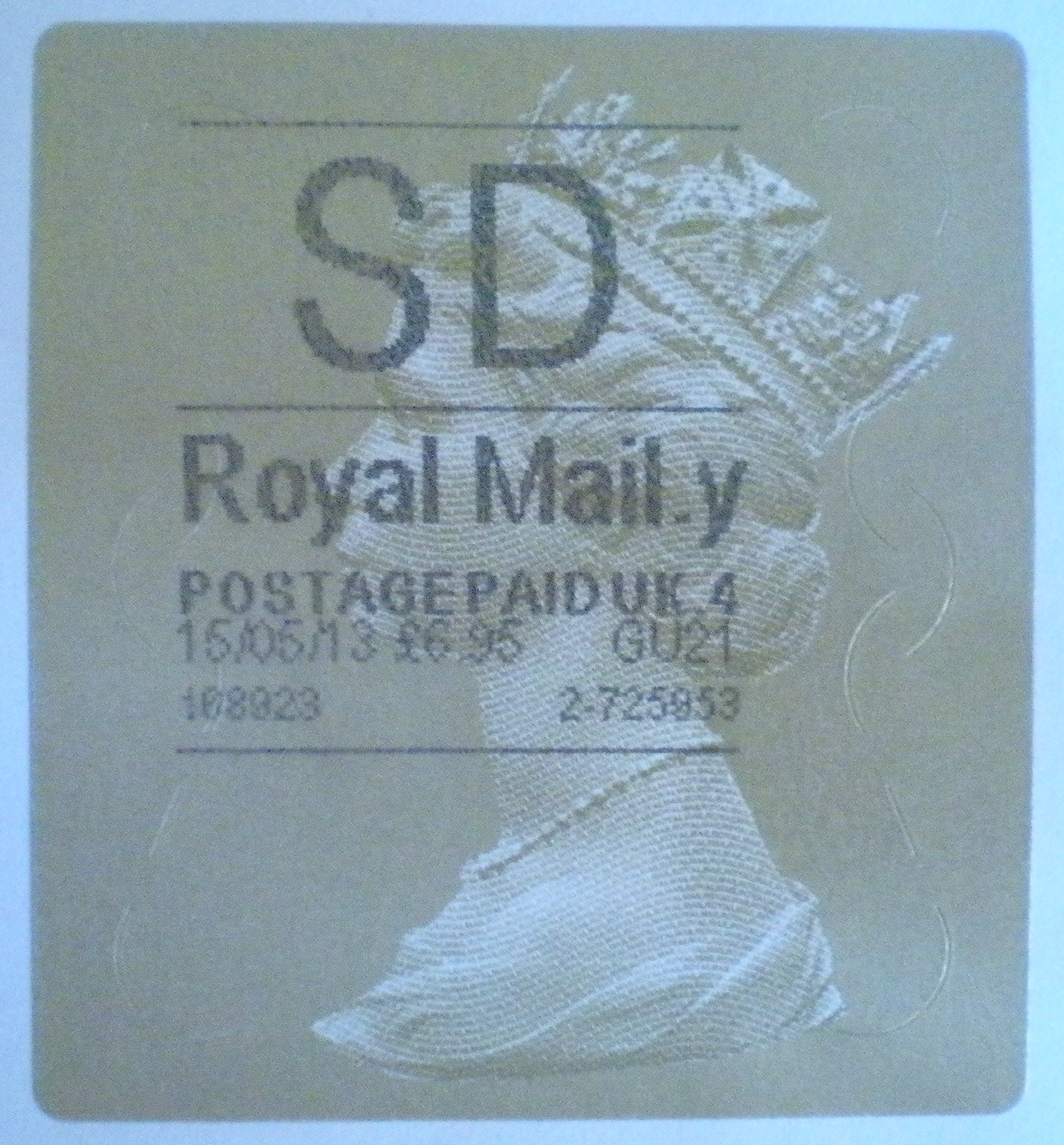
standard placing
The top line should be 6mm from the top, and the lines and text should start 9mm from the left. So it is quite correct that it shouldn’t be central! I can’t say why it wasn’t designed to be central (possibly a hangover from when the original white Horizon labels were narrower) but there we are.
The following, though a bit extreme is not uncommon:
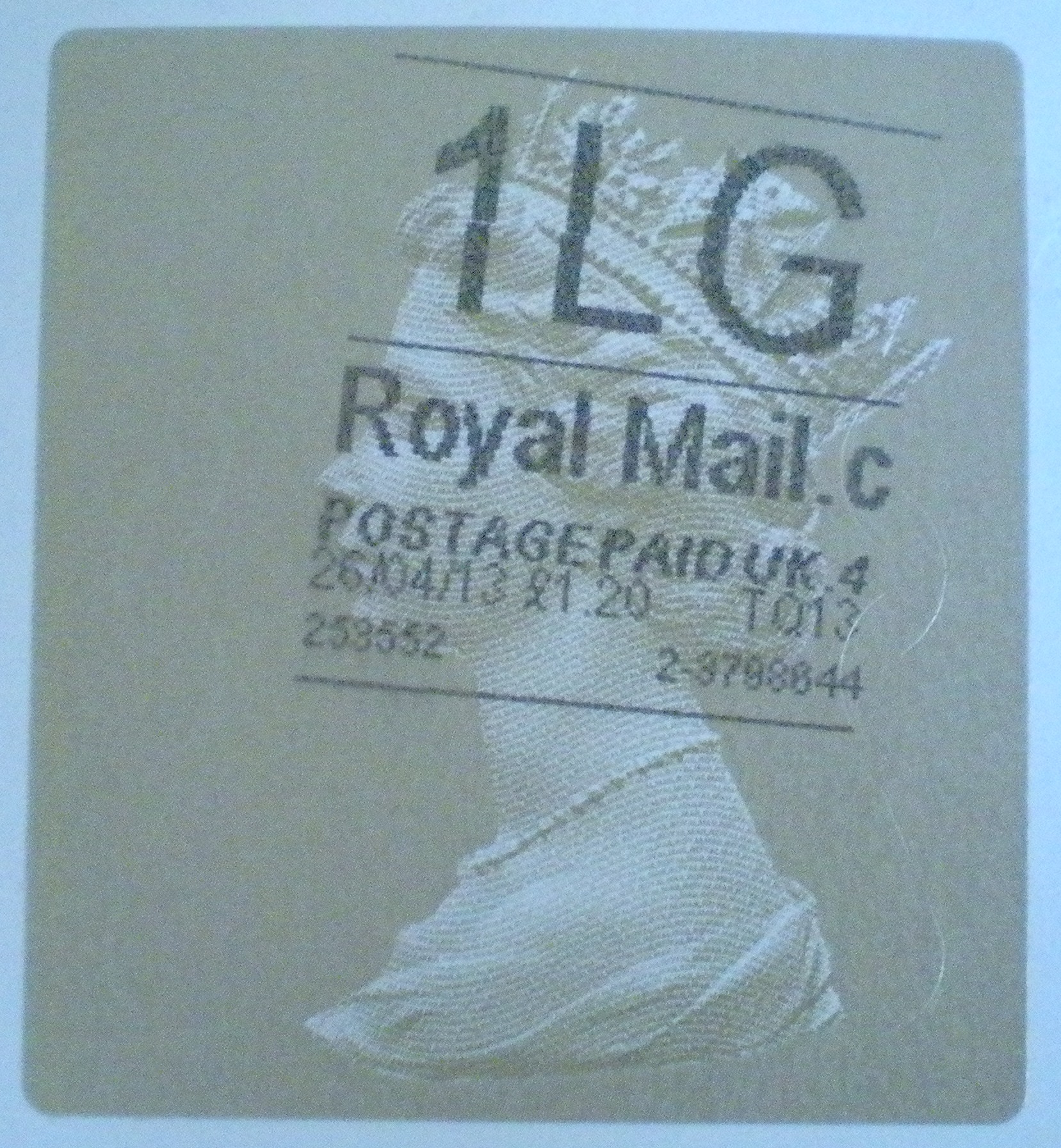
well tilted!
A slight tilt of a few degrees might be acceptable, as a shift of a couple of mm could be as well if the rest of the label is very good/rare – but the aim is absolutely level & in place. It’s what your eye will tolerate!
- Missing print
printer problems!
There should be no missing print at all. But as with our printers at home, those busy counter-printers have their problems as well! Examples such as this one simply detract from the overall appearance – more striking examples do exist but it is a moot point if they are truly collectable – a discussion for another day!
- Smudging
Of course smudging is a no-no. This one is printer generated:

indicator smudge
And this one? – finger generated:
placement smudge
And this one above the line, is just an added extra!
a curious one
Curious? Well it is a repeated error! Time and again I see examples of a short vertical line above the Queen’s crown. But unfortunately it does just look rather messy; so though, technically I suppose it is a variety I think pursuing that would be a little disingenuous!
I think also we need to think of overprints as cancellations. Technically I believe that is indeed what they are (and makes the label a ‘label’ and not a ‘stamp’). A good clean clear & upright strike therefore, is what is required!
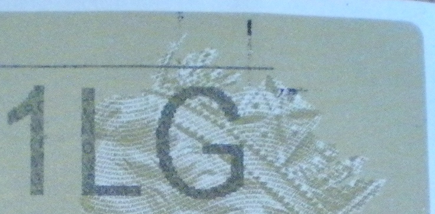
Overall it is the overprint that makes up the bulk of what we might call condition. For me, it must be straight, devoid of smudging and fully printed. Smudging can occasionally make for interesting errors – for instance ‘1EG’, and missing printing can look quite spectacular – but as there is no quality control (ie at the counter) they could not possibly be considered in the same vein as missing colour errors of some comemmoratives – but I do bin them at my peril!
Gold Horizon – the label itself
Posted: 29/05/2013 Filed under: Horizon, Machin, Stamp | Tags: Condition, cut-down, Horizon, Machin, Type 1, Type 2 Leave a commentCondition, as we know, is everything – what to look for then?
Well…
The first thing to consider is the condition of the label itself. Damage to a label should be viewed in the same light as damage to any other stamp – so there should be no:
Cuts:
those kiloware fiends happy with the scissors!
Tears:
not as easy to tear as stamps but it does happen
Creases:
quite common unfortunately – especially with items (1L & 2L) that go through normal sorting/cancelling machines; corners especially get turned up, like the hoover on the edge of the rug!
Lifted perfs:
only applicable to Type 1’s but especially in kiloware that’s seen better days – the die-cut perfs get rather ragged!
Wrinkles:
counter-staff are quite proficient with their Horizon machines these days & kinda slap them on willy-nilly & often results in the label not being flat giving a wrinkle or crease – ho hum!
Rubbing:
does happen sometimes – often to do with sorting/cancelling.
Overall I would say that any of these faults will significantly devalue an item. There are however one or two exceptions:
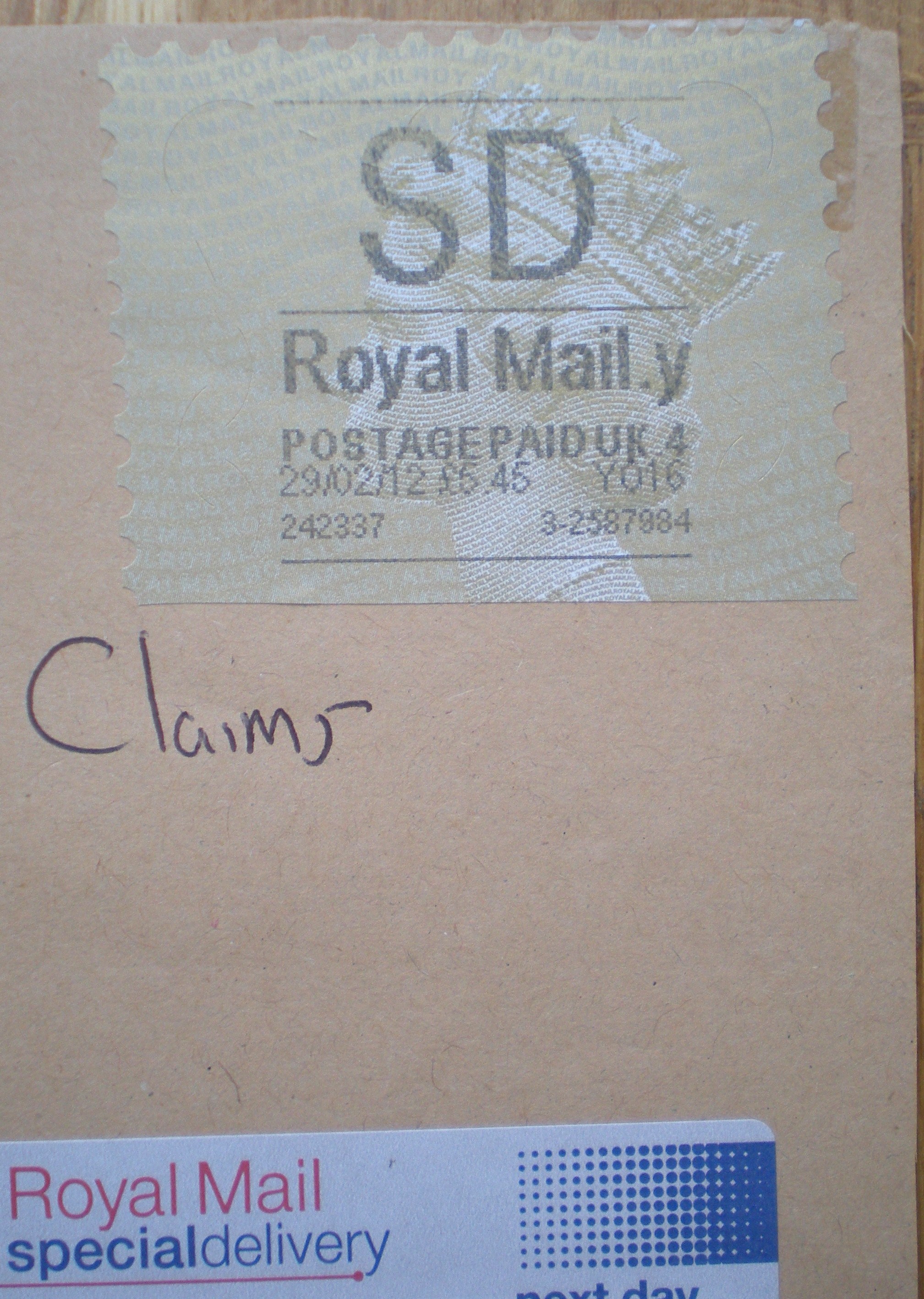
cut-down – operational use
- This label has been cut down solely not to obscure the address – purely operational. Some counter-staff do however wrap the label round the back! But then that obscures the service indicator so although cutting down maybe time consuming (with a queue out-the-door!) it makes sense.

cause for change!
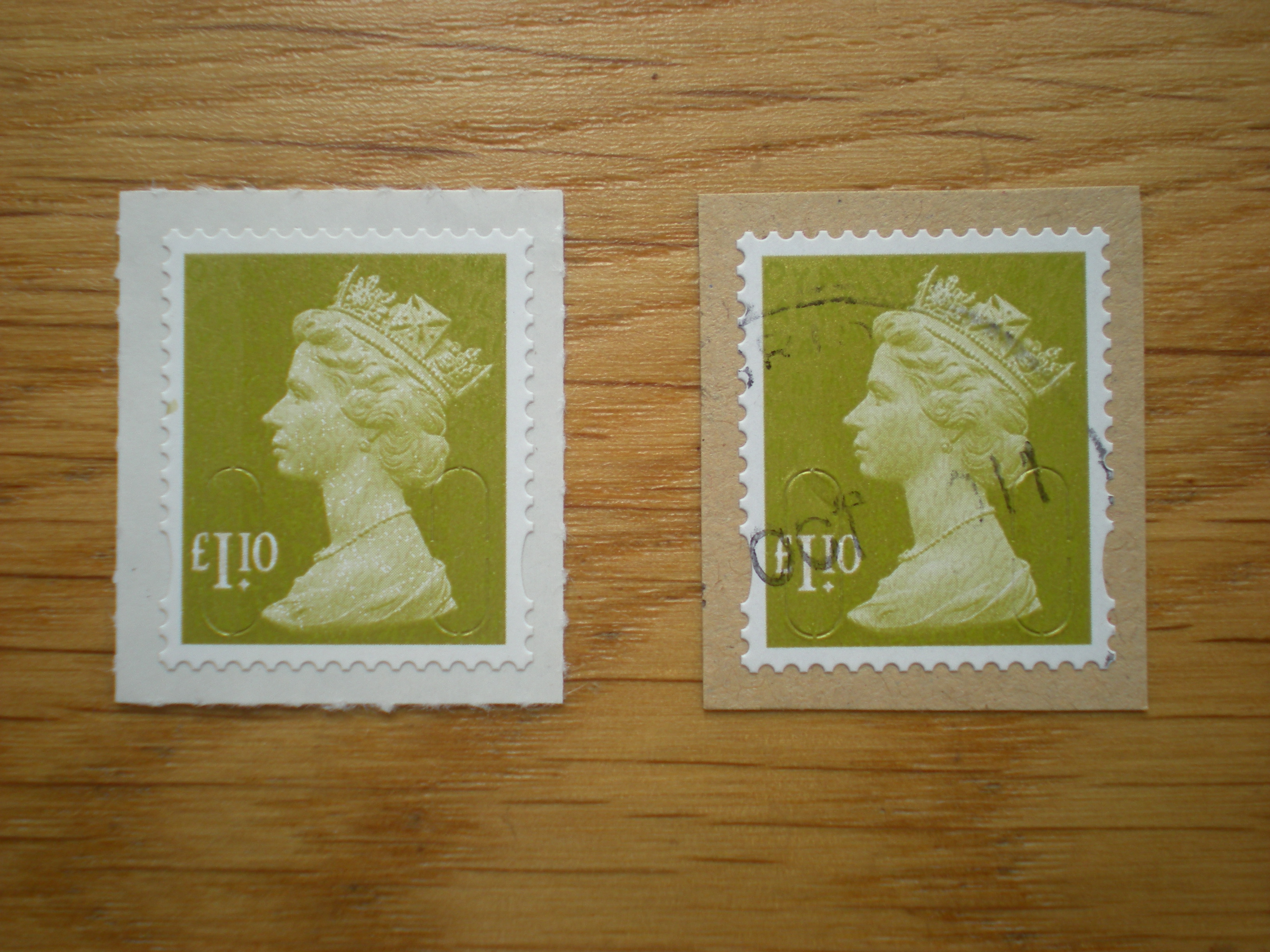
- These two show damage as a result of removing labels from their backing at the counter. Examples here (Types 1 & 2) both have security slits top & bottom (12 & 6 o’clock). Counter staff were finding that labels caught & ripped on removal from the backing – of course they couldn’t just do a new one as the service had already been paid & accounted for. This was the reason the Type 2a we have now is in use (without the top & bottom slits). Damage therefore is operational.
So from a collectors point of view I think having an example of security slit damage is valid but no more than that! For the cut-downs they’re actually not very common at all – so having more than a handful of examples will be quite difficult! However I think examples proving operational source will be the only ones worth having. Maybe the point is that they could never be regarded as varieties and anyway, I think we’d be on a ‘hiding to nothing’ collecting examples in each service indicator!
The Condition of Gold Horizon
Posted: 18/05/2013 Filed under: Machin, Stamp | Tags: Condition, Gold, Gold Horizon, Horizon, Label, Machin, self adhesives, Stamps Leave a commentIt’s all about condition:
Like all collecting (and of course stamps in particular) condition is everything. I thought when I started collecting labels, that well, they’re just labels, and one’s the same as another isn’t it? Errrr… Noo! So I thought I would jot down aspects I personally look for and attempt to marry them to those ubiquitous terms ‘fine’, ‘very fine’, ‘superb’ etc.
Firstly I think it very important to distinguish between collecting ‘on-piece’ and ‘on cover’. ‘On cover’ is of course much trickier as kiloware is not an option but is, ultimately, more interesting as the variety of operational use is quite surprising! For another day I think!
In addition I think it’s also valid to question why to collect ‘on-piece’ rather than ‘off-paper’. Well, it just seems to be a matter of general preference. Self adhesives have for some time been collected like this; visually, I think, it balances the mint example that is still on its backing paper.
Also the cost and fiddle of removing paper may outweigh the actual value of the stamp! So I think for Horizon ‘used on-piece’ is simple and convenient as well as lessening the chance of damage; after all the security slits are there for a reason!
So…
With all that aside I keep in mind 4 areas of condition that need consideration:
1: The label itself
2: The overprint (service indicator)
3: The paper or card it is adhered to
4: Other marks of any other kind
I will consider each in future blogs with some examples too.
Many thanks…
A

Recent Comments